User Interface Standards
From Computing and Software Wiki
User Interface Standards is created by Group 6 for 2009/2010 Software Engineering 4D03 Assignment 5. Group Members: Roshan Jesuratnam, Ashan Khan, Arturo Mata, Jaganvir Sandhu
This document specifically looks at Graphical User Interface (GUI) standards, over other types of interfaces which exist.
Contents |
Overview
A fundamental reality of application development is that the user interface is the system to the users. What users want is for developers to build applications that meet their needs and that are easy to use. Too many developers think that they are artistic geniuses – they do not bother to follow user interface design standards or invest the effort to make their applications usable, instead they mistakenly believe that the important thing is to make the code clever or to use a really interesting color scheme.
User interface design important for several reasons. First of all the more intuitive the user interface the easier it is to use, and the easier it is to use and the less expensive to use it. The better the user interface the easier it is to train people to use it, reducing your training costs. The better your user interface the less help people will need to use it, reducing your support costs. The better your user interface the more your users will like to use it, increasing their satisfaction with the work that you have done.
A collection of principles for improving the quality of your user interface design. These principles are, structure principle, simplicity principle, visibility principle, feedback principle, tolerance principle, reuse principle.
The most important thing you can possibly do is ensure your user interface works consistently. If you can double-click on items in one list and have something happen, then you should be able to double-click on items in any other list and have the same sort of thing happen. Put your buttons in consistent places on all your windows, use the same wording in labels and messages, and use a consistent color scheme throughout. Consistency in your user interface enables your users to build an accurate mental model of the way it works, and accurate mental models lead to lower training and support costs.
For a user interface standard to increase usability in the resulting products, two conditions have to be met: The standard must specify a usable interface, and the standard must be usable by developers so that they actually build the interface according to the specifications.
Clearly end users benefit from well-designed interface standards. However, organizations benefit as well. Organizations benefit from reduced production costs and more effective use of resources. Production costs are reduced because standards are essentially reusable, template-based building blocks. Developers identify the task a user seeks to execute on a given page, select the template based on that task, and then customize the page to fit the specific context of that task.
Standards
Windows
Window management is one of the most fundamental user activities. The main purpose is to require less effort from users to move their mouse across greater distances making window placement more predictable and therefore easier to find.
Title Bar
- All windows should have a title bar even if the window doesn’t have a title (which should be a very rare exception). Use the title bar controls as follows:
- Close: All primary and secondary windows with a standard window frame should have a Close button on the title bar. Clicking Close has the effect of canceling or closing the window.
- Minimize All primary windows and long-running modeless secondary windows (such as progress dialogs) should have a Minimize button. Clicking Minimize reduces the window to its taskbar button. Consequently, windows that can be minimized require a title bar icon.
- Maximize/Restore down All resizable windows should have a Maximize/Restore down button. Clicking Maximize displays the window in its largest size, which for most windows is full screen; whereas clicking Restore down displays the window in its previous size. However, some windows don't benefit from using a full screen, so these windows should maximize to their largest useful size.
Windows Title
- A document window should display the name of the document being viewed. Application windows display the application name. Panels display a descriptive title appropriate for that window. If the contents of the window can change, it might be appropriate to change the title to reflect the current context.
- NOTE: If you need to display more than one item in the title, separate the items with a dash (—) with space on either side.
- NOTE: The main viewer window of Mail displays the currently selected message mailbox and the selected folder, if any. When a message is viewed in its own window, the message title is displayed. Don’t display pathnames in window titles. When displaying document titles, use the display name and show the extension if the user has elected to show extensions.
Windows Size
- Choose a default window size appropriate for its contents. Don't be afraid to use larger initial window sizes if you can use the space effectively.
- Use resizable windows whenever practical to avoid scroll bars and truncated data. Windows with dynamic content and lists benefit the most from resizable windows.
- For text documents, consider a maximum line length of 65 characters to make the text easy to read. (Characters include letters, punctuation, and spaces.)
- Should set a minimum window size if there is a size below which the content is no longer usable. For resizable controls, set minimum resizable element sizes to their smallest functional sizes, such as minimum functional column widths in list views:
- Should change the presentation if doing so makes the content usable at smaller sizes.
- May be optimized for higher resolutions, but sized down as needed at display time to the actual screen resolution.
Windows Location
- For the following guidelines, "centering" means to bias vertical placement slightly towards the top of the monitor, instead of placing exactly in the middle. Do this because the eye is naturally biased towards the top of the screen.
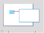
- If a window is contextual, always display it near the object that it was launched from. Place it out of the way so that the source object isn't covered by the window. If displayed using the mouse, when possible place it offset down and to the right.
- Show contextual windows near the object that it was launched from
- If a window isn't related to the current context or user action, place it away from the current pointer location. Doing so prevents accidental interaction.
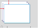
- If a window is a top-level application or document, always cascade its origin off the upper-left corner of the monitor. If created by the active program, use the active monitor; otherwise, use the default monitor.
- Cascade top-level application or document windows off the upper-left corner of the monitor
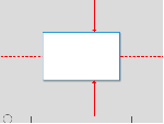
- If a window is a top-level utility, always display it "centered" in the monitor. If created by the active program, use the active monitor; otherwise, use the default monitor.
- Center top-level utility windows
- If necessary, adjust the initial location so that the entire window is visible within the target monitor.
- If a resizable window is larger than the target monitor, reduce it to fit.
- Window order (Z order)
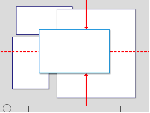
- Always place owned windows on top of their owner window. Never place owned windows under their owner windows, because most likely users won't see them.
- Respect users' Z order selection. When users select a window, bring only the windows associated with that instance of the program (the window plus any owner or owned windows) to top of the Z order. Don't change the order of any other windows, such as independent instances of same program.14
Windows Activation
- Respect users' window state selection. If an existing window needs attention, flash the taskbar button three times to draw attention and leave it highlighted, but don't do anything else. Don't restore or activate the window. Don't use any sound effects. Instead, let users activate the window when they are ready.
- Exception: If the window doesn't appear on the taskbar, bring it to the top of all the other windows and flash its title bar instead.
- Restoring a primary window should also restore all its secondary windows, even if those secondary windows have their own taskbar button. When restoring, place secondary windows on top of the primary window.
Persistence
- When a window is redisplayed, consider displaying it in the same state as last accessed. When closing, save the monitor used, window size, location, and state (maximized vs. restore). When redisplaying, restore the saved window size, location, and state using the appropriate monitor. Also, consider making these attributes persist across program instances on a per-user basis. If the window is larger than the monitor, resize the window as necessary.
- Move the location toward the upper-left corner to fit within the monitor as necessary.
Scrolling Windows
- People use scroll bars to view areas of a document or a list that is larger than can fit in the current window. Only active windows can be scrolled. A window can have a horizontal scroll bar, a vertical scroll bar, both, or neither. A window that has one or more scroll bars also has a resize control in the bottom right corner.
- The scroller size reflects how much of the content is visible; the smaller the scroller, the less of the content the user can see at that time. The scroller represents the relative location, in the whole document, of the portion that can be seen in the window.
- The user can use scroll bars by doing the following:
- Dragging the scroller. This method is usually the fastest way to move around a document. The window’s contents changes in “real time” as the user drags the scroller.
- Clicking a scroll arrow. This means, “Show me more of the document that’s hidden in this direction.” The scroller moves in the direction of the arrow. Each scroll arrow click moves the content one unit; your application determines what one unit equals. For example, a word processor would move a line of text per click, a spreadsheet could move one row or column. To ensure smooth scrolling effects, specify units of the same size throughout a document.
- Clicking or pressing in the scroll track. Clicking advances the document by a windowful (the default) or to the pointer’s hot spot, depending on the user’s choice in Appearance preferences. A “windowful” is the height or width of the window, minus at least one unit of overlap to maintain the user’s context. This unit of overlap should be the same as one scroll arrow unit (for example, a line of text, a row of icons, or part of a picture). The Page Up and Page Down keys also move the document view by a windowful. Pressing in the scroll track displays consecutive windowfuls of the document until the location of the scroller catches up to the location of the pointer (or until the user releases the mouse button).15
- NOTE: It’s best not to add controls to the scroll-bar area of a window. If you add more than one control to this area, it’s hard for people to distinguish among controls. It’s best to place the majority of your features in the menus as commands. Only frequently accessed features should be elevated to the primary interface.
Asthetics
Titles and Icons
- Icon genres help communicate what users can do with an application before they open it. Applications are classified by role—user applications, software utilities, and so on—and each category, or genre, has its own icon style.
Fonts
- In traditional typography, a font describes a combination of a typeface, a point size, and attributes. A typeface is the look of the font. Segoe UI, Tahoma, Verdana, and Arial are all typefaces. Point size refers to the size of the font, measured from the top of the ascenders to the bottom of the descenders, minus the internal spacing (called leading). A point is roughly 1/72 inch. Finally, a font can have attributes of bold or italic.
Color
- Color is an important visual element of most user interfaces. Beyond pure aesthetics, color has associated meanings and elicits emotional responses. To prevent confusion in meaning, color must be used consistently. To obtain the desired emotional responses, color must be used appropriately.
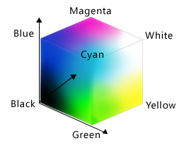
- Color is often thought of in terms of a color space, where RGB (red, green, blue), HSL (hue, saturation, luminosity), and HSV (hue, saturation, value) are the most commonly used color spaces.
- The RGB color space can be visualized as a cube.
- While display technology uses RGB values and consequently developers often think of colors in terms of RGB, the RGB color space doesn't correspond to how people perceive color. For example, if you add red to dark cyan, the result isn't perceived as more red but as lighter cyan.
Interaction
Mouse
- The mouse is the primary input device used to interact with objects in most operating systems. The term mouse can also refer to other pointing devices, such as trackballs, touchpads and pointing sticks built into notebook computers, pens used with Tablets and Touch Technology, and, on computers with touchscreens, even a user's finger.
- Physically moving the mouse moves the graphic pointer (also referred to as the cursor) on the screen. The pointer has a variety of shapes to indicate its current behavior.
- Moving the mouse without pressing the mouse button moves the pointer, or cursor. The onscreen pointer can assume different shapes according to the context of the application and the pointer’s position. For example, in a word processor, the pointer takes the I-beam shape while it’s over the text and changes to an arrow when it’s over a tools palette. Change the pointer’s shape only to provide information to the user about changes in the pointer’s function.
- Just moving the mouse changes only the pointer’s location, and possibly its shape. Pressing the mouse button indicates the intention to do something, and releasing the mouse button completes the action.14
- Clicking
- Clicking has two components: pushing down on the mouse button and releasing it without moving the mouse. (If the mouse moves between button down and button up, it’s dragging, not clicking.)
- The effect of a click should be immediate and obvious. If the function of the click is to cause an action (such as clicking a button), the selection is made when the button is pressed, and the action takes place when the button is released. For example, if a user presses down the mouse button while the pointer is over an onscreen button, thereby putting the button in a selected state, and then moves the pointer off the button before releasing the mouse button, the onscreen button is not clicked. If the user presses an onscreen button and rolls over another button before releasing the mouse, neither button is clicked.
- Double-Clicking
- Double-clicking involves a second click that follows immediately after the first click. If the two clicks are close enough to each other in terms of time (as set by the user in Keyboard & Mouse preferences) and location (usually within a couple of points), they constitute a double click.
- Double-clicking is most commonly used as a shortcut for other actions. Because not everyone is physically able to perform a double click, it should never be the only way to perform an action.
- Some applications support triple-clicking. For example, in a word processor, the first click sets the insertion point, the second click selects the whole word, and the third click selects the whole sentence or paragraph. Supporting more than three clicks is inadvisable.
- Pressing and Holding
- Pressing means holding down the mouse button while the mouse remains stationary. Pressing by itself should have no more effect than clicking does, except in well-defined areas such as scroll arrows, where it has the same effect as repeated clicking, where it displays a menu. For example, pressing a Finder icon should select the icon but not open it.
- Dragging
- Dragging means pressing the mouse button, moving the mouse to a new position, and releasing the mouse button. The uses of dragging include selecting blocks of text, choosing a menu item, selecting a range of objects, moving an icon from one place to another, and shrinking or expanding an object.
- Dragging a graphic object should move the entire object (or a transparent representation of it), not just the object’s outline.
- Your application can restrict an object from being moved past certain boundaries, such as the edge of a window. If the user drags an object and releases the mouse button outside the boundary, the object stays in the original location. If the user drags the item out of the boundary and then back in before releasing the mouse button, the object moves to the new location.
Touch
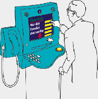
- Many touch interactions are performed using gestures and flicks. A gesture is a quick movement of one or more fingers on a screen that the computer interprets as a command, rather than as a mouse movement, writing, or drawing. Some User Interfaces allow multitouch gestures such as pan, zoom, rotate, two-finger tap, and press and tap. One of the quickest and easiest gestures to perform is a flick. A flick is a simple gesture that results in navigation or an editing command. Navigational flicks include drag up, drag down, move back, and move forward, whereas editing flicks include copy, paste, undo, and delete.
- A manipulation is a real-time, physical handling of an object. A manipulation differs from a gesture in that the input corresponds directly to how the object would react naturally to the action in the real world. For example, a photo viewing application might allow users to manipulate a photo by moving, zooming, resizing, and rotating the image. Multitouch manipulations use multiple contact points simultaneously.14
- Design concepts:
- Using touch for input has the following characteristics:
- Natural and intuitive. Everyone knows how to point with a finger and touch things. Object interactions are designed to correspond to how users interact with objects in the real world in a consistent manner.
- Less intrusive. Using touch is silent, and consequently much less distracting than typing or clicking, especially in social situations such as meetings. Compared to using a pen, using a finger is particularly convenient because you don't have to locate or pick up a pen.
- Portable. A computer with touch capability can be more compact because most tasks can be completed without a keyboard, mouse, or touchpad. It can be more flexible because it doesn't require a work surface. It enables new places and scenarios for using a computer.
- Direct and engaging. Touch makes you feel like you are directly interacting with the objects on the screen, whereas using a mouse or touchpad always requires you to coordinate hand movements with separate on-screen pointer movements—which feels indirect by comparison.
- Reduced accuracy. Users can't target objects as accurately using touch, compared to a mouse or pen. Consequently, you can't expect users to tap or manipulate small objects.
- Each input device has its strengths and weaknesses:
- The keyboard is best for text input and giving commands with minimal hand movement.
- The mouse is best for efficient, precise pointing.
- Touch is best for object manipulation and giving simple commands.
- When thinking about touch support for your program:
- Don't assume that if a UI works well for a mouse, it also works well for touch. While good mouse support is a start, a good touch experience has a few additional requirements.
- You can assume that if a UI works well for a finger, it also works well for a pen. Making your program touchable goes a long way to providing good pen support. The primary difference is that fingers have a blunter tip, so they need larger targets. And again, hover must be optional.
- Don't depend on touch pointer to fix touch UI problems. Because the touch pointer isn't as easy to use as direct input, view the touch pointer as a last resort for programs that haven't been designed for touch.15
Keyboard
- The keyboard is the primary input device used for text input in computers. For accessibility and efficiency, most actions can be performed using the keyboard as well.
- Keyboards can also refer to virtual, on-screen keyboards and writing pads used by computers without a physical keyboard, such as tablet-based computers.
- Shortcut keys
- By contrast, shortcut keys have the following characteristics:
- They primarily use Ctrl and Function key sequences (Windows system shortcut keys also use Alt+non-alphanumeric keys and the Windows logo key).
- They are primarily for efficiency for advanced users.
- They are assigned only to the most commonly used commands.
- They are intended to be memorized, and are documented only in menus, tooltips, and Help.
- They have effect throughout the entire program, but have no effect if they don't apply.
- They must be assigned consistently because they are memorized and not directly documented.
- They aren't localized.
- Because shortcut keys are intended to be memorized, the most frequently used shortcut keys ideally use letters from the first or most memorable characters within the command's keywords, such as Ctrl+C for Copy and Ctrl+Q for Request.
- Finally, because they are intended to be memorized, application-specific shortcut keys make sense only for programs and features that are run frequently enough for motivated users to memorize. Infrequently used programs and features don't need shortcut keys. For example, setup programs and most wizards don't need any special shortcut key assignments, nor do infrequently used commands in a productivity application.
Messages
Errors and Warnings
- A perfect UI would not need any error messages, but it is accepted that this cannot be achieved so error messages are necessary. Generally standard rules for the presentation of error messages are:
- Error messages should be straight forward for as many users as possible regardless of culture, age and impairment.
- It should be easy to understand that an error has occurred.
- It should be clear what the user has to do to correct the error.
- It should be clear for the user where the error was found in the application.
- Make sure the user can see that an error has occurred. Error messages need to stand out from the rest of the layout.
- Use an error icon if your layout makes it difficult to visually separate errors from the rest of the page.
- Be consistent when you present errors (the user will expect errors to be displayed at the same location and with the same style on all pages).
- Do not use complicated words. (tip: check out Ogdens basic english)
- Describe what the user should do to correct the error, especially if it could be difficult to understand.
- Make it clear if there were more than one error so that the user can correct all errors at once.
- For advanced users, adding in the ID number of the error can help a lot in figuring out the source of the error because it has an identity from which the user can search information about.
Confirmation and Notifications
- Generally the same rules as above for errors are followed but there are a few disparities:
- Notification areas in the application are generally not as eye catching as error messages
- Confirmation messages provide users to control an aspect of the application
- Both types of messages should have a consistant look so the type can be easily recognized
Text
As both the UI and User get more advanced, less and less text is being used. Regardless, text still makes up a huge part of any interface so there are still standards being followed:
Font Type
- There are hundreds of different serif and sans serif fonts available, both with their own advantages and disadvantages. Serif fonts improve readability in continuous text, because the serifs help readers to structure and discriminate characters. An example of a serif font is Times New Roman as the figure shows. Typically, newspapers, magazines, and books use serif fonts. Sans serif fonts like Arial do not feature these little strokes, as you can see in the figure to the right. On computer screens, sans serif fonts are preferable, because relatively low screen resolutions—typically around 100 pixels per inch rather than the 800 dots per inch of print—make serif fonts look fuzzier, especially in small sizes.
Font Size
- Font size plays a huge role in determining if font is readable or not. Software developers often simply use the common font—for example, 10-pixel Verdana or Arial. While it makes sense to recommend standard font sizes for software or Web sites, keep this in mind: :Font size is just one determinant of the physical size of a character on a computer screen. Thus, it is more appropriate to base our recommendations for character size on physiological measures. In other words, what matters is what a user actually sees on the screen, not what a product team has designed and developed. A more detailed explanation can be found at http://www.uxmatters.com/mt/archives/2009/01/text-treatment-and-the-user-interface.php
Style and Justification
- Text orientation is not an issue for English software, as it is always horizontal and from left to right. Other places in the world, the direction of the text is important, whether it be from right to left or from top to down.
- In terms of justification, there are generally two options available:
- Ragged right - The text body is left aligned
- Justified - A box of text is created, straight on both the left and right sides
- Although justifying continuous text provides a nice block of text, the extra spaces that appear between individual words often create continuous vertical spaces that can appear meaningful—like vertical rivers of white so it is standard to use ragged right to avoid this issue.
Commands and Controls
Menus
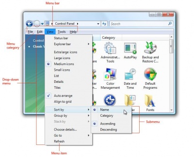
- Drop-down menus are menus displayed on demand on mouse click or hover. They are normally hidden from view and therefore are an efficient means of conserving screen space. A submenu or cascading menu is a secondary menu displayed on demand from within a menu. They are indicated by an arrow at the end of the submenu label. A menu item is an individual command or option within a menu. Menu's are standardly contained in a menu bar at the top of an application as shown in the picture to the right. The following are standard guidelines for the usage of menu's in an application:
- All menu patterns except menu bars need a drop-down arrow to indicate the presence of a pull-down menu. The presence of menus goes without saying in a menu bar, but not in the other patterns.
- Don’t change menu item names dynamically because doing so is confusing and unexpected. An exception is that you can change menu item names that are based on object names dynamically. For example, lists of recently used files or window names can be dynamic.
- If there are only a few commands (three or less), consider lighter alternatives such as toolbar menus, or more direct alternatives such as command buttons and links.
- Do not have too many options in one menu, it can become overwhelming and distracting. A good limit is 10 items in a menu.
- A menu should have the option to be hidden if most of the commands are available through a toolbar or other sources.
- Choose single word names for menu categories. Using multiple words makes the separation between categories confusing.
- For programs that create or view documents, use the standard menu categories such as File, Edit, View, Tools, and Help. Doing so makes the application consistant and common menu items predictable and easier to find.
- Only use submenu's if necessary, they make things harder to locate because of the nesting.
- It is inefficient to put commonly used items in a sub menu unless there are easier ways to use that command, such as a toolbar button.
- Icons are useful in menu's, but are not required for every command. You do not want to create clutter with hard to read icons for every command.
- Shortcut keys should be assigned to only the most common menu items, to speed up the process for advanced users. Remember to be consistant with shortcuts because changing them up can create confusion (ex. Cut is always ctrl-x)
- The following is a general menu structure for the most common menu, File:
- File
- New Ctrl+N
- Open... Ctrl+O
- Close
- <separator>
- Save Ctrl+S
- Save as...
- <separator>
- Send to
- <separator>
- Print... Ctrl+P
- Print preview
- Page setup
- <separator>
- 1 <filename>
- 2 <filename>
- 3 <filename>
- ...
- <separator>
- Exit Alt+F4 (shortcut usually not given)
- File
Toolbars
- Toolbars make a great addition to menu's. They do not include as many commands as a menu, but show the most commonly used ones with easy to recognize buttons. Generally toolbars are contained right under the menu bar, or at the sides of the screen if more room is required. Standard guidelines for the usage of toolbars are:
- Toolbar commands should be instant, for example clicking print on the toolbar will print the document automatically with the settings already saved, but clicking print from the menu bar would lead to a user input screen with more options
- Toolbars should not be hidden, so using the space well is very important, organization of the buttons is crucial to allow fast results
- Menu's provide comprehensiveness, therefore toolbars should provide efficiency to avoid overlap
- Only add a customizable toolbar if there are enough commands to validate the use of it.
- If space is at a premium, save space by:
- Omitting the labels of well-known icons and less frequently used commands.
- Using only a partial toolbar instead of the entire window width.
- Consolidating related commands with a menu button or split button.
- Using an overflow chevron to reveal less frequently used commands.
- Displaying commands only when they apply to the current context.
- Disable individual toolbar buttons that don’t apply to the current context, instead of removing them. Doing so makes toolbar contents stable and easier to find.
- Disable individual toolbar buttons if clicking on them would directly result in an error. Doing so is necessary to maintain a direct feel.
- For the unlabeled icons toolbar pattern, remove entire toolbars if they don’t apply to the current context. Display them only in the applicable modes.
Textboxes
- Text boxes are a double edge sword, they are very versatile but also have very few constraints. Basically you can restrict the amount of space in a textbox and whether numeric or alphabetical characters are allowed within it. Labels are a necessary addition to textbox's to show what needs to be put in the text box. General guidelines are:
- When disabling a text box, also disable any associated labels, instruction labels, spin controls, and command buttons.
- Only use auto complete to help the user fill in common information faster, do not use it for sensitive information such as passwords or PIN numbers
- If you expect data to be larger than the text box and you can readily make the text box larger without harming the layout, size the box to eliminate the need for scrolling.
- For numeric input, you may use a spin control. For textual input, use a drop-down list or editable drop-down list instead.
- Limit the length of the input text when you can. For example, if the valid input is a number between 0 and 999, use a numeric text box that is limited to three characters. All parts of text boxes that use formatted data input must have a short, fixed length.
- Be flexible with data formats. If users are likely to enter text using a wide variety of formats, try to handle all the most common ones. For example, many names, numbers, and identifiers can be entered with optional spaces and punctuation, and the capitalization often doesn’t matter.
Radio Buttons
- With a radio button, users make a choice among a set of mutually exclusive, related options. Users can choose one and only one option. Radio buttons are so called because they function like the channel presets on radios. There are a few guidelines for the use of these:
- List the options in a logical order, such as most likely to be selected to least, simplest operation to most complex, or least risk to most. Alphabetical ordering is not recommended because it is language dependent and therefore not localizable.
- Leave dependent editable text boxes and drop-down lists enabled if they share the radio button’s label. When users type or paste anything into the box, select the corresponding option automatically. Doing so simplifies the interaction.
- Avoid nesting radio buttons with other radio buttons or check boxes. If possible, keep all the options at the same level.
- Make the first option the default option, since users often expect that—unless that order isn’t logical. To do this, you might need to change the option labels.
- Every radio button should have a label
Links
- With a link, users can navigate to another page, window, or Help topic; display a definition; initiate a command or choose an option. A link is text or a graphic that indicates that it can be clicked, typically by being displayed using the visited or unvisited link system colors. Traditionally, links are underlined as well, but that approach is often unnecessary and falling out of favor to reduce visual clutter. Here are some generally used guidelines:
- A link that has been clicked must appear different than one that hasn't, usually this is done with bold and unbold
- Display a busy pointer if the result of clicking a link isn’t instantaneous. Without feedback, users might assume that the click didn’t happen and click again.
- Use the theme or link system colors for visited and unvisited links. The meaning of these colors is consistent across all programs. If for any reason users don’t like these colors (perhaps for accessibility reasons), they can change them themselves.
- Don’t use graphics-only links. Users have difficultly recognizing them as links and any text within the graphic (used to indicate their action when clicked) creates a localization problem.
Principles
These principles are in nature heuristics of interface design. They are guidelines that "should" be used in the design of interfaces, since there is no one industry standard. These general rules provide a basis to build on for an user interface designer.
The similarities between these two sets of guidelines is indicative of the rules interface designers should follow to offer end users efficient ease of use.
Ten Usability Heuristics
Jakob Nielsen, a user adovacate and principal of the Nielsen Norman Group for enhancing user experience, outlines the following heuristics;[1]
- Visibility of system status
System should indicate the state/progress it is in through appropriate feedback. - Relate system and real world
System should be 'natural' in order to speak the user's language. Concepts should be similar to real-world conventions. - User Control and freedom
Interface should encourage user to explore features and give them a sense on control over the system. - Consistency and standards
Interface should have same meanings of words as other applications. Other interfaces in the system should be used as a guideline when designing a new one. - Error Prevention
System should be designed to prevent errors from happening. By implementing various error handling mechanisms (autocorrect, messages, etc.), users should be able to fix and continue with workflow. - Recognition rather than recall
Controls of the interface should be easily visible in order to reduce short term memory load. - Flexibility and effciency of use
Allow shortcuts for frequently used features for experienced users to maximize effciency through flexible alternatives. - Aesthetic and minimalistic design
Discard irrelevant information in dialogues to ensure relevant units of information does not lose their relative visibility. - Help users recognize, diagnose, and recover from errors
All error messages should be illustrated in clear, simple language (no codes) where users undoubtedly recognize the problem and follow a constructive solution. - Help and documentation
Help and documentation should be easy to search focused on the user’s task with a list of clear concrete steps to be carried out. Limit all possible ambiguities.
- Visibility of system status
Eight Golden Rules of Interface Design
From the book Designing the User Interface, Ben Shneiderman outlines eight key rules of good interface design;[2]
- Strive for consistency
Consistency must be implemented within itself and other interfaces. This ensures a "global" understanding of where things are and where one would look for it. See Figure 1 for example. - Enable frequent users to use shortcuts
Expert users should not be bound by interaction styles that may slow progress. Thus, enabling shortcuts through speed keys, hidden commands, marcos, etc. will optimize pace of interaction while reducing the number of interactions. - Offer informative feedback
Major or infrequent actions should make aware the user, with descriptive and clear information of what is occuring. - Design dialog to yield closure
Sequences of actions should be grouped with a beginning, middle and end. This gives the user a sense of direction and accomplishment of the task. - Offer simple error handling
Design the interface in a manner which the chance of human error is impossible. However, since it is impossible to predict every behaviour, design it in a way such that it offers informative feedback explaining the details of the error and how it could be solved. - Permit easy reversal of actions
Allow users to undo their mistakes. This allows users to have a sense of security in case a mistake occurs. It also allows users to explore without consequences. - Support internal locus of control
Users should be the initiators of actions rather than responders. Actions should respond quickly with delay and offer response. - Reduce short-term memory load
Reducing sequences of events and commands allows the user to be aided in tasks. Keep the display simple so it is intuitive for the user.
- Strive for consistency
Design
A collection of principles for improving the quality of your user interface design. These principles[3] are
- The structure principle.Your design should organize the user interface purposefully, in meaningful and useful ways based on clear, consistent models that are apparent and recognizable to users, putting related things together and separating unrelated things, differentiating dissimilar things and making similar things resemble one another. The structure principle is concerned with your overall user interface architecture.
- The simplicity principle.Your design should make simple, common tasks simple to do, communicating clearly and simply in the user’s own language, and providing good shortcuts that are meaningfully related to longer procedures.
- The visibility principle.Your design should keep all needed options and materials for a given task visible without distracting the user with extraneous or redundant information. Good designs don’t overwhelm users with too many alternatives or confuse them with unneeded information.
- The feedback principle.Your design should keep users informed of actions or interpretations, changes of state or condition, and errors or exceptions that are relevant and of interest to the user through clear, concise, and unambiguous language familiar to users.
- The tolerance principle.Your design should be flexible and tolerant, reducing the cost of mistakes and misuse by allowing undoing and redoing, while also preventing errors wherever possible by tolerating varied inputs and sequences and by interpreting all reasonable actions reasonable.
- The reuse principle.Your design should reuse internal and external components and behaviors, maintaining consistency with purpose rather than merely arbitrary consistency, thus reducing the need for users to rethink and remember
Techniques
In the book, The Object Primer by Scott Ambler. It outlines the following tips and techniques that one should think about when creating a user interface;[3]
- Consistency
Ensure interface works in a consistent manner which enables user to build an accurate model of the way it works. - Set standards and stick to them
Use a consistent interface design standard throughout. All aspects of software must follow Agile Modeling (AM)’s Apply Modeling Standards. - Be prepared to hold the line
Be open to stakeholder’s ideas and suggestions. Inform stakeholders when developing the user interface of your corporate UI standards. - Explain the rules
Explain all rules in a clear consistent manner to avoid problems. - Navigation between major user interface items is important
Be sure the system is flexible enough to support various approaches to ensure your user will make sense of the application. A user interface-flow diagram is optional to further understand the flow of your user interface. - Navigation within a screen is important
Organize navigation between widgets in a consistent manner users will find recognizable. - Word your messages and labels effectively
Illustrate text (messages and labels) through clear, effective language. Avoid inconsistency. - Understand the UI widgets
Adopt an effective UI widget standard in your application. - Look at other applications with a grain of salt
Create authentic application which follows the user interface-standards and guidelines of your organization. - Use color appropriately
Colours should be used sparingly for accessibility reasons. If colours are used, they should be used with a secondary indicator which does not discriminate. Colours should also be consistant throughout the application. - Follow the contrast rule
Background and foreground should contrast enough for the user to easily read contents of the interface. - Align fields effectively
Editable fields (i.e textboxes) should be aligned to be visually appealing and promote efficiency through features such as 'tabbing'. - Expect your users to make mistakes
Allow easy reversal of actions. See Principles - Justify data appropriately
Left justify string, Right justify numbers, Decimal justify floating point numbers. - Your design should be intuitable
Interfaces should be easy to learn and should encourage the user to explore and become familiar with its elements. - Don’t create busy user interfaces
Interfaces should be simple at best. Clutter causes confusion and stalls efficient workflow. - Group things effectively
Related features should be effectively grouped together, whereas items which are not should be distinctly separated. - Take an evolutionary approach
Methods such as rapid prototyping and Agile Model Driven Development are critical approaches in designing user interfaces.
- Consistency
References
[1] Nielsen, Jakob. Ten Usuability Heuristics. http://www.useit.com/papers/heuristic/heuristic_list.html
[2] Shneiderman, Ben. Eight Golden Rules of Interface Design. http://faculty.washington.edu/jtenenbg/courses/360/f04/sessions/schneidermanGoldenRules.html
[3] Ambler, Scott. The Object Primer. http://www.ambysoft.com/essays/userInterfaceDesign.html
[4] Thovtrup , Henrik , & Nielsen, Jakob. (1991). Assessing the usability of a user interface standard. Retrieved from http://www.ambysoft.com/essays/userInterfaceDesign.html
[5] MSDN, Initials. (2009). User interface standards. Retrieved from http://msdn.microsoft.com/en-us/library/aa217660%28office.11%29.aspx
[6] © Copyright Usernomics, Initials. (2008). User interface design. Retrieved from http://www.usernomics.com/user-interface-design.html
[7] Molich, R., and Nielsen, J. (1990). Improving a human-computer dialogue, Communications of the ACM 33. 3 (March), 338-348.
[8] Nielsen, J., and Molich, R. (1990). Heuristic evaluation of user interfaces. Proc. ACM CHI'90 Conf. (Seattle, WA, 1-5 April), 249-256.
[9] Nielsen, J. (1994a). Enhancing the explanatory power of usability heuristics. Proc. ACM CHI'94 Conf. (Boston, MA, April 24-28), 152-158.
[10] Nielsen, J. (1994b). Heuristic evaluation. In Nielsen, J., and Mack, R.L. (Eds.), Usability Inspection Methods, John Wiley & Sons, New York, NY.
[11] Apple Human Interface Guidelines. Retrieved from http://developer.apple.com/mac/library/documentation/UserExperience/Conceptual/AppleHIGuidelines/XHIGIntro/XHIGIntro.html
[12] Windows User Experience Interaction Guidelines. Retrieved from http://download.microsoft.com/download/e/1/9/e191fd8c-bce8-4dba-a9d5-2d4e3f3ec1d3/ux%20guide.pdf
[13] Beta Research. Standards and Guidelines Retrieved from http://www.beta-research.com/standards.html

