Common Interface Mistakes
From Computing and Software Wiki
Contents |
Introduction
Introduction
Schneiderman's Eight Golden Rules of Interface Design
Ben Schneiderman, an American computer scientist and researcher in the field of human–computer interaction (HCI), outlined in his book "Designing the User Interface" the following rules for interface design:
1. Strive for consistency
2. Enable frequent users to use short-cuts
3. Offer informative feedback
4. Design dialogs to yield closure
5. Offer error prevention and simple error handling
6. Permit easy reversal of actions
7. Support internal locus of control
8. Reduce short-term memory load
These rules make for a good outline when designing an interface for a customer, colleague, or friend.
Examples
Example 1:
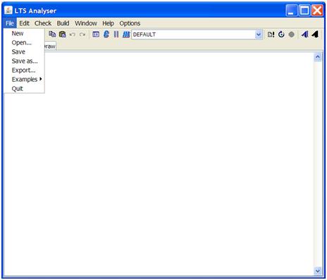
As stated in Schneiderman’s Eight Golden Rules of Interface Design, there should be shortcuts available to frequent users of the application. In this example of the “LTS Analyser”, there are no shortcut keys to access the menu items. This can cause great frustration for users that are used to common shortcut keys used in most applications.
Example 2:
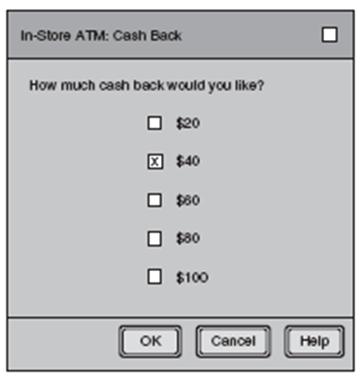
There are form controls that serve different purposes in interface design. This example uses checkboxes, where radio buttons would be much more appropriate. This is because multiple checkboxes can be selected, while only a single radio button is available at an instance in time. If the user selects more than one checkbox for their Cash Back amount, how much cash will they receive? It is completely unknown to the user.
Example 3:

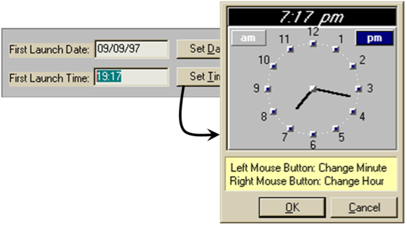
The time in the text field appears to be editable, however it is not. This is a bad affordance. The only way to set the time is to press the "Set Time" button, which then pops up a new dialog with an analog clock face. To set the time with this clock face the user must use their left mouse button to change the minutes and their right mouse button to change the hours. Also the way in which the times are displayed lacks consistency, the time on the right (in the textbox) is in 24-hour time and the one at the top left is in 12-hour time.
Example 4:

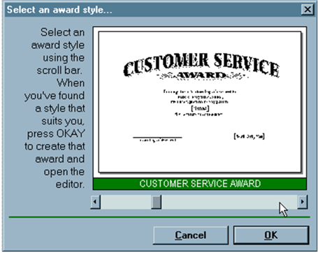
This example allows a user to select a template from a given list of templates. In the instructions to the left its says "... press OKAY", the user will not be able to find this since the button it is intended for is labeled as "OK". This will confuse a novice user.
The horizontal scroll bar is not consistent with other applications. Here the scroll bar moves the user through the list of templates. Generally the horizontal scroll bar shows the unseen area of the current selection. This should be replaced with forward and back buttons.
Finally for an experienced user who knows exactly what template they want, there is no quick way to go to or find that template. This is lacking a shortcut for the user to enter the one they want. Also even if there was a place for the user to enter the number of the one they wanted, they would have no idea which one it was because as we can see from the image there are no references to how many templates there are or what template you are currently on.
Example 5:
Conclusion
It is very important for current and future software developers, especially in the field of HCI, to be aware of the issues presented in this document. Even a fantastic application, having high efficiency and complex algorithms will greatly suffer and become useless very quickly if it has a poorly designed user interface.


