Common Interface Mistakes
From Computing and Software Wiki
m |
|||
| Line 6: | Line 6: | ||
== Schneiderman's Eight Golden Rules of Interface Design == | == Schneiderman's Eight Golden Rules of Interface Design == | ||
| - | Ben Schneiderman, an American computer scientist and researcher in the field of human–computer interaction (HCI), outlined in his book "Designing the User Interface" the following rules for interface design: | + | [http://en.wikipedia.org/wiki/Ben_Shneiderman Ben Schneiderman], an American computer scientist and researcher in the field of human–computer interaction (HCI), outlined in his book "Designing the User Interface" the following rules for interface design:<br> |
<br> | <br> | ||
| + | 1. Strive for consistency<br> | ||
| + | 2. Enable frequent users to use short-cuts<br> | ||
| + | 3. Offer informative feedback<br> | ||
| + | 4. Design dialogs to yield closure<br> | ||
| + | 5. Offer error prevention and simple error handling<br> | ||
| + | 6. Permit easy reversal of actions<br> | ||
| + | 7. Support internal locus of control<br> | ||
| + | 8. Reduce short-term memory load<br> | ||
<br> | <br> | ||
| - | + | These rules make for a good outline when designing an interface for a customer, colleague, or friend. | |
| - | + | ||
| - | + | ||
| - | + | ||
| - | + | ||
| - | + | ||
| - | + | ||
| - | + | ||
| - | + | ||
| - | + | ||
| - | + | ||
| - | + | ||
| - | + | ||
| - | + | ||
| - | + | ||
== Examples == | == Examples == | ||
| - | + | Example1:<br> | |
| - | + | [[Image:Interface_Example1.JPG]]<br> | |
| + | As stated in Schneiderman’s Eight Golden Rules of Interface Design, there should be shortcuts available to frequent users of the application. In this example of the “LTS Analyser”, there are no shortcut keys to access the menu items. This can cause great frustration for users that are used to common shortcut keys used in most applications.<br> | ||
| + | <br> | ||
| + | Example2:<br> | ||
| + | [[Image:Interface_Example2.JPG]]<br> | ||
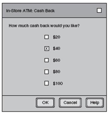
| + | There are form controls that serve different purposes in interface design. This example uses checkboxes, where radio buttons would be much more appropriate. This is because multiple checkboxes can be selected, while only a single radio button is available at an instance in time. If the user selects more than one checkbox for their Cash Back amount, how much cash will they receive? It is completely unknown to the user.<br> | ||
== Conclusion == | == Conclusion == | ||
Conclusion | Conclusion | ||
Revision as of 21:40, 13 November 2009
Contents |
Introduction
Introduction
Schneiderman's Eight Golden Rules of Interface Design
Ben Schneiderman, an American computer scientist and researcher in the field of human–computer interaction (HCI), outlined in his book "Designing the User Interface" the following rules for interface design:
1. Strive for consistency
2. Enable frequent users to use short-cuts
3. Offer informative feedback
4. Design dialogs to yield closure
5. Offer error prevention and simple error handling
6. Permit easy reversal of actions
7. Support internal locus of control
8. Reduce short-term memory load
These rules make for a good outline when designing an interface for a customer, colleague, or friend.
Examples
Example1:
As stated in Schneiderman’s Eight Golden Rules of Interface Design, there should be shortcuts available to frequent users of the application. In this example of the “LTS Analyser”, there are no shortcut keys to access the menu items. This can cause great frustration for users that are used to common shortcut keys used in most applications.
Example2:
There are form controls that serve different purposes in interface design. This example uses checkboxes, where radio buttons would be much more appropriate. This is because multiple checkboxes can be selected, while only a single radio button is available at an instance in time. If the user selects more than one checkbox for their Cash Back amount, how much cash will they receive? It is completely unknown to the user.
Conclusion
Conclusion


